Aaron’s Top 20 Picks for the Best Original Criterion Collection Cover Art of 2017
 Taking a cue from Why So Blu’s Jason Coleman and his picks for his favorite movie posters of the year, this seemed like a fun idea at the time, but it turned out to be a bigger challenge than anticipated. The Criterion Collection currently releases roughly 60-70 films a year. Some of these are reissues, which were omitted from this list (sorry Le Samourai and Straw Dogs) but others are completely new to the collection, and with that, you get some brand new cover art. For the sake of this post, I have decided to remove any cover art that was simply the original theatrical poster (Sorry Being There and Barry Lyndon), as I wanted to focus on the new interpretations for certain classics and acclaimed contemporary releases by way of the artwork associated with them. So without further ado, here are the top 20.
20. The Before Trilogy (1995, 2004, 2013)

This is a tough one to put so low on the list (although it made the final cut). The box is a nice subtle way to convey what this trilogy accomplishes, but the art for the individual films just doesn’t quite hit the write marks as far as how it depicts the characters.
19. Meantime (1984)

Part of what anyone can see with Criterion is how simple a lot of their art is. This one is a bit more busy, but one still grasps at how boredom and degrade a person through the image of a man sinking in a chair.
18. Rumble Fish (1983)

Francis Ford Coppola’s spiritual and much artsier follow-up to The Outsider holds onto the dreamlike tone in this cover, which helps to emphasize the emotion present throughout this film.
17. Tampopo (1985)

The beautiful blend of colors does an excellent job of portraying the eccentricity found in a film about a noodle-shop owner in search of the perfect recipe.
16. La poison (1951)

Sacha Guitry’s wonderful dark comedy has a great cover placing this sour married couple front and center with these comic portrayals, highlighting their bitterness, as well as the ways they plan to dispatch each other.
15. Election (1999)

This modern comedy classic captures the eagerness of Tracy Flick’s character in a simple item; a cupcake designed to win over another vote she desperately wants so she can hold office as high school president.
14. The Marseille Trilogy (1931, 1932, 1936)
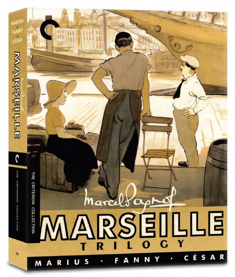
I’ve yet to see Marcel Pagnol’s Marseille trilogy, but these are lovely hand-drawn images featuring a limited bust specific amount of color that show me the films present sentimental tales of love in everyday life.
13. Ghost World (2001)

The Daniel Clowes artwork from his original comic was the perfect choice for a proper cover on this Criterion release of the wonderfully sardonic Terry Zwigoff cult favorite teenage comedy.
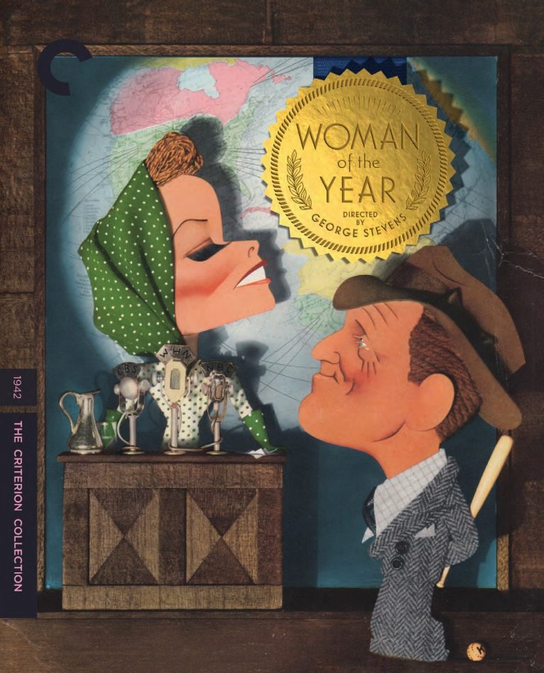
12. Women of the Year (1942)
A few screwball comedies made their way to Criterion this year, but this George Stevens film has the most creative cover. The placement of the seal amidst this symbolic cutout presentation of Katherine Hepburn and Spencer Tracy’s characters is a nice touch for sure.
11. Personal Shopper (2016)

Another example of simplicity; if you are familiar with the plot, you understand the distortion of the light appearing on Kristen Stewart and her expression matches the character’s disposition as she seeks closure and solace, following the death of her brother.
10. The Lodger: A Story of the London Fog (1927)

One of Hitchcock’s earliest films receives a cover that reflects the silent film era by way of some roughly drawn characters and a silhouette. The color contrast is nice, and the implications are quite clever.
9. Breaking Point (1950)

At first glance, I believed this to be a still image, before looking closer. Taking in more of what this cover art had to offer, the Ernest Hemingway adaptation is given the proper look of a thriller featuring a captain making some very specific choices in his life. The rifle, blurred in the foreground, only helps.
8. Mildred Pierce (1945)

It’s back-to-back Michael Curtiz films, as Mildred Pierce is also given considerable treatment as far as emphasizing the nourish angles for this character-study of a hardworking mother. Showing Mildred in one of her lowest moments, while wrapped in that fur coat is a great single image, and the colors are wonderfully chosen.
7. Certain Women (2016)

The idea of using a pastel painting (or perhaps watercolor) is kind of perfect for this subtle triptych that emphasizes multiple stories about the isolation and loneliness of a few Montana-based women in their lives.
6. Dheepan (2015)
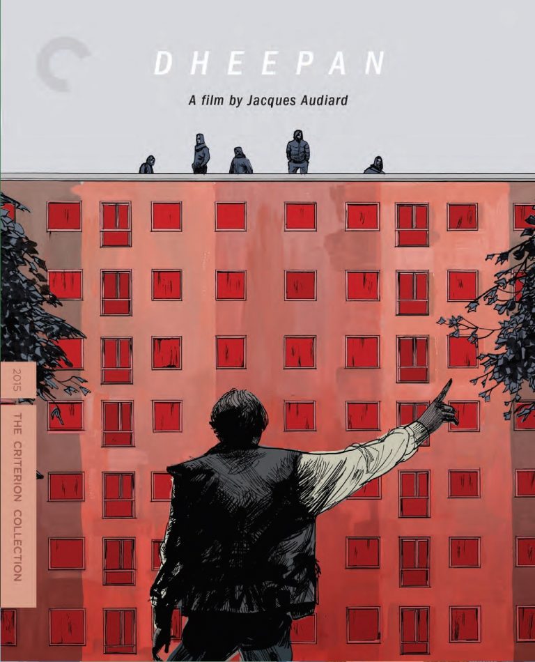
I dig the use of color for the apartment building that plays a significant role in this Palme d’Or winner. The striking image of Dheepan in the foreground, as he gives a signal to the ominous figures on the top of the building says a lot about the sort of tension to be found in this film as well.
5. Canoa: A Shameful Memory (1976)

This is the one entry on this list where the cover made me want to see the film, despite knowing nothing about it at the time. A political movie from Mexico, Canoa’s art features a clever use of a priests costume to show the corruption and violence that’s about to emerge.
4. Stalker (1979)
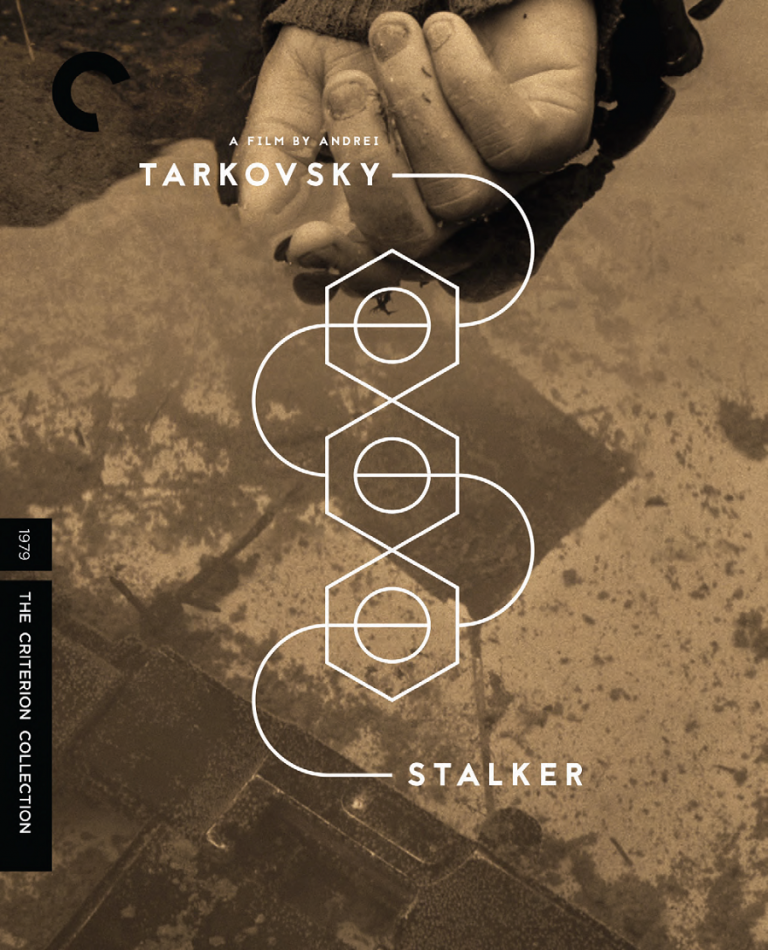
It is always interesting to note the choices made when it comes to adding new Andrei Tarkovsky films to The Criterion Collection and his final film has been given a clever cover design. While alluding to an aspect of the story and conceptual ideas, it’s an alluring but straightforward image that works for this film.
3. They Live By Night (1948)

This cover art likely wins for being the coolest addition to Criterion, as the blue tint over this very noir-ish imagery easily makes you think it belongs on the shelf with other pulp novels.
2. L’Argent (1983)

This is such a simple idea that evokes the main imagery associated with the original posters for this film. Still, this Robert Bresson drama does have a focus on how various people deal with a counterfeit bill and the depiction of this exchange conveys this action front and center.
1. 45 Years (2015)
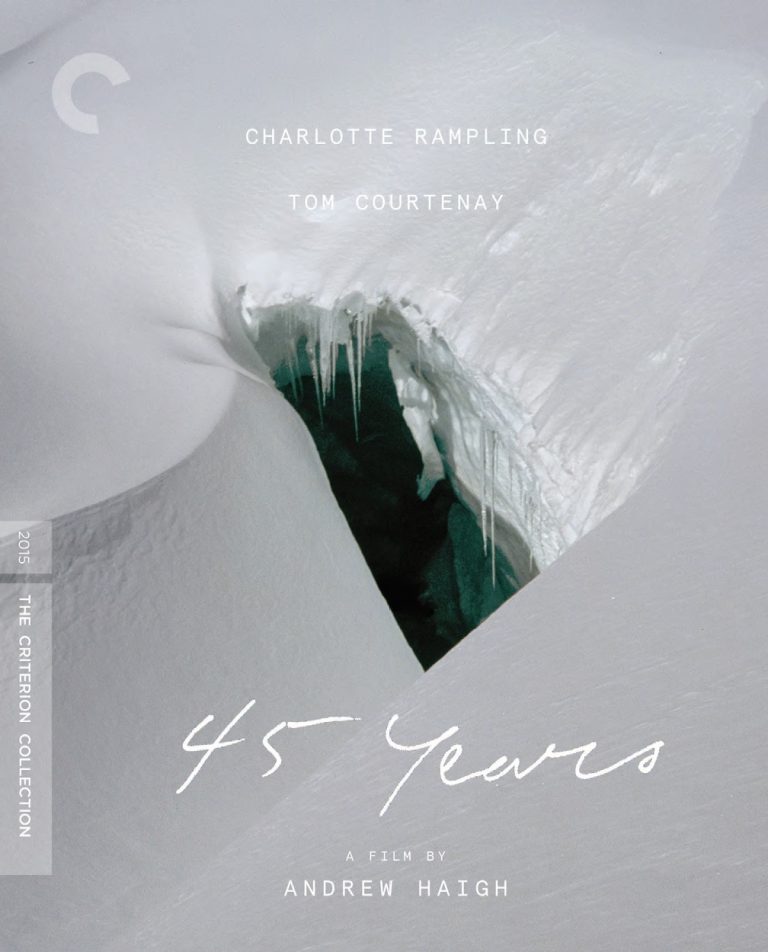
I did not know what I would end up with as my number one pick, but it became clear that 45 Years was the one to land at the top of the list. The image is incredibly specific to an event that sets the film in motion, but the idea of this imagery serving as the cover for this movie evokes so much about what’s going on with the marriage seen in the film, especially following a particular revelation that I applaud whoever Criterion found to come up with this idea.
***


Sorry, not a fan of the Election cover. Rather it be a pile of the Tracy Flick buttons.
Fittingly enough, that’s the disc art.
I would have a hard time organizing this list. Some of my favorite covers are last number-wise in this list. I need to see Personal Shopper yet so I can at least understand that cover.
Just read this – fantastic idea Aaron! Love all the artful covers chosen especially Mystery Shopper, Ghost World and the noir feel of They Live By Night. (And Election may be simple, but also sinfully sweet!) A selection any Criterion collector would be proud to put on display. (aka more like this awesome original list please!)